Timeline: 10 weeks
Type: Partner project with 1 other web designer
My Role: Creative Direction of Marketing, Web Design, Graphic Design, Project Management
Tools: Figma, Illustrator, Photoshop, Procreate
Hapa: A Short Film
A website and other marketing materials for the pre- and post-production stages of a short film project
Design Opportunity
Abby Alishio is the writer and director of Hapa, a short film now in post-production awaiting release. In order to get this short film funded and produced, Abby and their team needed a coordinated marketing strategy that included visual materials, a website, and an online social presence.
Response
I joined Hapa’s marketing team and art department to aid in the visual communication of the story both off and on screen. Through effective branding strategy, we were able to communicate core themes from the screenplay and resonate with appropriate audiences. This allowed us to acquire actors for auditions, raise enough money to exceed our funding goals, and gain immense support in the forms of sponsorships, catering, donations, and more.
What is Hapa?
Hapa is a short film that follows a young half Japanese and half white girl on her first tumultuous day of middle school. The screenplay tells a bittersweet, nostalgic tale of the early 2010’s, when racism was complex and keen for young teens of color. Each act features different examples of overt and covert racism overshadowing subtle celebrations of the main characters’ cultures. Such themes needed to be translated into a marketing strategy in order to get the short film into production.
Unpacking the Screenplay
I first began my research with a deep analysis of the screenplay provided by the director. In order to fully understand the essence of the story, I broke down the acts into different structures of the hero’s story to locate beats of building emotion.
Combing through the text, I brought forth themes and motifs, tried to summarize the screenplay from my own perception of it, and asked the director and producer questions to further develop the story.


Synthesis: Making Hapa Shine
After multiple discussions with the director and producer, we came to a consensus on what needed to be communicated on the website over the lifetime of the film from pre- to post-production. We knew it was going to be important to visually portray the personality of the main character, Hana, and the events that transpired in her story on the website and all of the marketing materials.
Capturing the Mood
I brought to the director and producer several conceptual moodboards to try to encapsulate the mood of the screenplay. Each concept speaks to the different themes present in the story, primarily youthful exuberance brought down by an overall melancholy.
General feedback favored the first and fourth moodboards, as they spoke the most to the main character and her plight throughout the film. Hana begins the story as a middle schooler excited and nervous about her first day of school, but is brought down by the reality of racism in many kinds of contexts.
What’s on the Website?
In planning for the launch of the website, we had to consider the structure and timing of release of information to spearhead different phases of production. Several pages were vital to be released at the same time as the crowdfunding site, while others would launch in tandem with the promotion of the film during filming, editing, and post-production.
Ideation
It was important to create a hero image for the website in the initial phases of the website’s life, as filming and editing was still months away. Before we could place a film still or trailer on the landing page, we needed a bold hero shot that would communicate the tone and theme of the story. At this time, we also needed to begin casting calls and thus required a brochure to send out to different schools and parents.
Idea 1
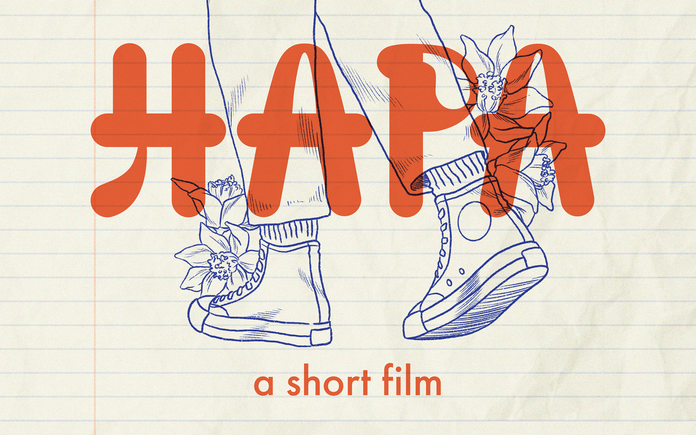
This first visual concept captures the ephemeral emotions that are rampant in middle school, with an overall muted color palette to reflect that touch of harsh reality. This theme uses a sans-serif font to portray the rigidity of reality in contrast to the fluid and lightweight line stroke of the illustrations.
Idea 2
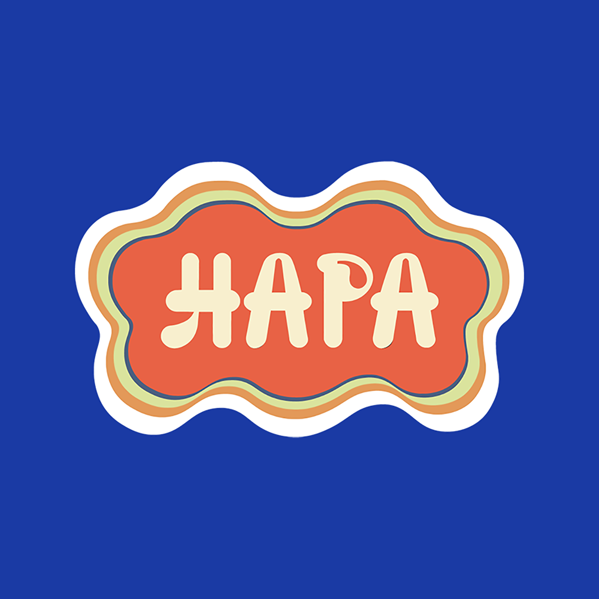
In contrast to the first concept, this theme is more playful in its expression, as Hana is a quiet character who has her moments of braveness. Taking that idea, I explored the use of bold colors and the use of a vector illustration style to capture Hana’s youth and straightforward personality. The Hapa logo was hand drawn by my partner and evokes a cultural motif in its rounded curves and brush stroke quality.
Idea 3
The final concept dives into Hana’s cultural heritage, as her two halves are blended and are a point of contention throughout the film. As a celebration of her Japanese culture, this concept brings in different elements into a collage. The color palette emulates her inner desire to be bold and herself against her outer environment muting her expression. The font used for the logo is a script typeface to portray a personal and youthful personality.
The director and producer provided guiding critique, explaining that each concept is reaching the themes of the story quite well, but must strike a balance between youthful/playful visuals and sobering/mature colors. Furthermore, there was a desire to see more craft-based visuals instead of digitally created graphics.
How Does Everything Flow?
In tandem with creating the visuals, I also began wireframing the pages of the website to discuss with the team on how we wished to communicate different elements of the story and its production. Feedback sessions with my team and the directors helped us decide on what information required more hierarchy.
Thinking, Creating, Refining…
My partner and I continued our ideation, developing visual languages around the hero image that would represent the film on the landing page.
We explored using a yuzu fruit as a motif, using photographs to create ambience, and placing blocks of information in different engaging ways. We wished for each page to be easy to access and so iterated different navigation formats and link placements.
Further Development
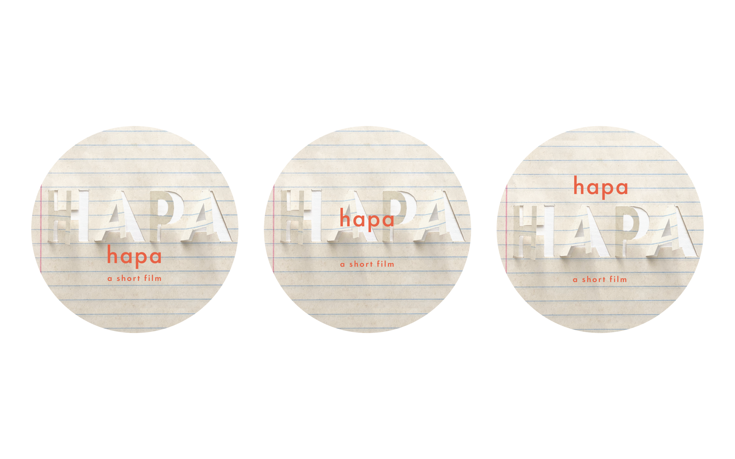
As we got closer to our final concept, we grew attracted to the use of paper texture and bold bright colors, as they spoke thematically to Hana and her story.
The director and producer agreed that this visual language was much closer in tone but needed a touch of youth back, as it seemed a bit sanitized in comparison to the time period the film takes place in, the 2010’s.
The Final Design
My partner and I achieved this final design for the visual system of the website and all corresponding marketing materials. The hand-drawn logo sits atop layers of color that are fluid in shape, reminiscent of the silly-bandz popular with kids of the time.
The logo is framed by drawn yuzu flowers, evocative of a blue ballpoint pen one might use to doodle on notebook pages. All around are silly-bandz that are time-appropriate motifs of the short film.
Visual System
Instagram Assets
Cast & Crew ID Cards
Promotional Poster


