Timeline: 6 weeks
Type: Team project with 3 other designers
My Role: Research, Prototyping, UI/UX Design, Illustration
Tools: Figma, Principle
The Burke Hunt
An exhibition explorer app for parents and their children
Design Opportunity
The Burke Museum does not have a companion app to compliment the existing visitor experience.
Response
The Burke Hunt is an explorer app to help kids ages 5-9 and their parents to find different exhibits within the museum and learn information and details that they may not otherwise.
Full Clickthrough
What is the Burke?
The Burke Museum is a museum of natural history, holding a wealth of artifacts and information for visitors of all ages to view and learn more about. The museum is a popular location for field trips, family outings, and fun excursions. However, with so many different displays in the exhibitions that are quite confusing or sensitive, it can be difficult to navigate one’s own experience, especially with a child in tow.
The Burke Museum could benefit from a companion app to aid visitors locate different exhibits and enhance the overall experience.
What’s the Burke Up To?
Artifact Analysis
My team began our research by analyzing existing materials that the Burke Museum supplies visitors to supplement their visits. We took note on the purpose of each material and if it was effective in aiding visitors plan, experience, or understand their visit.


Observations
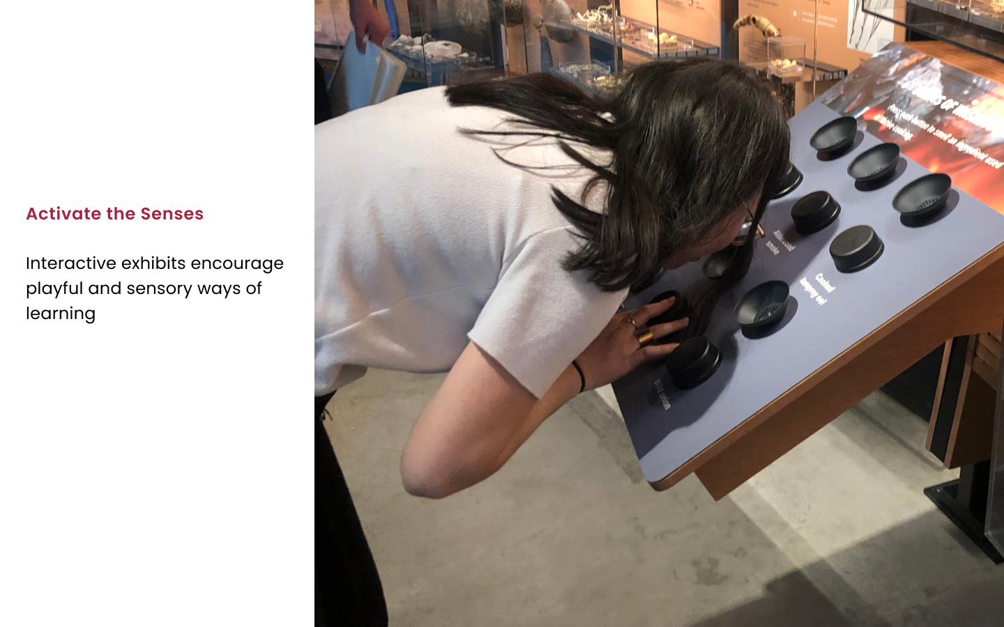
We visited the museum and documented our experience. From our observations, we noticed how the museum provides many opportunities for visitors to interact with complex displays and topics, but is often overwhelming or not always approachable for all ages, particularly the youth.


Expert Interview
Interviews with employees of the museum yielded helpful insight into the museum’s intentions and the ways in which the experience could be improved.


Competitive Analysis
A competitive analysis against other natural museum apps showed a common weakness when it comes to enhancing the museum experience. Most other apps serve as a compendium of all artifacts held at the museum displayed on a map for navigation purposes. While helpful for walking around the museum, such apps seldom invite greater conversation beyond the map.


Synthesis: Who Can We Help?
Target Audience
We identified the key target audience we wished our design solution to address to be parents experiencing the museum with a child aged 5 to 9.
Children at such an age have general knowledge about museums, but are intrigued by the unique opportunity to experience interactive exhibits, research, and natural history within the Burke.
Journey Map
We created a journey map to better understand the general flow of the museum experience. We wished to find areas of potential pain points and marked those instances with a red dot.
Stakeholder Goals
Listing out stakeholder goals helped us figure out commonalities that could be achieved by our design solution.
We primarily found that both parent/child visitors and the Burke institution have common goals of fostering curiosity, enhancing memorable experiences by way of pedagogical bonding, and ultimately bridging the information gap between children and the complex topics displayed in the Burke Museum otherwise not encountered in daily life.
Final Key Insights
The Burke offers opportunities for discussion and questions that can be expanded on while exploring with museum.
A free flowing museum experience enables visitors to more easily draw connections and engage with content.
How might we help parents cultivate their child’s curiosity by immersing them in the Burke Museum experience?
Our Design Principles
We determined that our design solution needed to be:
Let’s Dive In!
Initial Ideation
After a couple rounds of ideation, we found four common themes underlining each of our concepts:
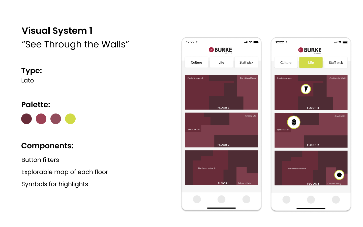
And while aspects of each theme will influence our final design, we had decided to move forward with the “route guidance” theme to be the driving force of our wireframing process. We explored the idea of enhancing the common museum map seen in our competitive analysis into an interactive map that involves exploring exhibits for highlighted artifacts and “collecting” them through the phone’s camera (much like the existing Husky Hunt). Visitors can engage with the content by working through clues and discussion points.
Initial User Flow
To better understand the user’s behavior and flow of thought for this concept, we detailed the primary user goals that visitors would have when interacting with the app.
Low Fidelity Wireframes
We then expanded those user goals into wireframe to better understand the potential interactions.
Initial Visual System Concepts


Refined Wireframes
Based off of the initial wireframes that show the flow of each user goal, we created refined wireframes that show the user experience of onboarding the app, using clues to discover an artifact, and adding the artifact to the collection. We expanded on the second visual system, “Ready for Red” in these wireframes as well.
Feedback
After running user tests and talking with other designers for critique, we received the following key points from feedback on our refined wireframes:
In the onboarding experience, it is unclear what the purpose of “entering the museum” is, as it defies the natural flow of delving in (the user can see the map of the interior before being able to “head on inside”).
The UI for the clues pages should become more integrated for the child. It does not have a good sense of playfulness for children to engage with.
The clues icon in the navigation bar is rendered useless if clues are available upon tapping the artifact icon.
It is unclear when the mystery artifact presents itself. Does it appear as a notification when the app is not in use?
The visual system needs to be more unified; there is a mix of line drawings, vector drawings, and inconsistent line weight.
Such feedback was incredibly helpful as we were able to address them in our final design.
Final Design
Visual System
Onboarding
The game begins with an introduction from Tufts the T-Rex (named after the actual t-rex fossil display from the Burke Museum). Tufts, the mascot of the Burke Hunt, leads the user (whether parent or child) through the experience of the app.
We forwent the onboarding experience that had the user “go inside” the Burke Building. I instead animated Tufts to introduce the app in a tutorial manner to better explain the user goals.
The Map
The maps of each floor have organic forms to symbolize different exhibits. We chose to represent the map in this abstract way so as to give vague indications of where each artifact is without giving away the exact location.
I employed a toggle microinteraction for the user to switch between each floor and animated the artifact icons to jump up after each time the toggle is switched.
The Clues
The user then selects an artifact to find on their journey and are presented with three clues to aid in finding it.
Earlier feedback suggested that we make the clues pages more integrated for the child. We decided to instead have our clue pages serve as conversation starting points to promote bonding between parent and child. This addresses our first design principle: Guiding.
No matter who is holding the phone, whether parent or child, these clues guide the conversation with facts that the parent can explain to their child, or even vice versa.
The Camera
Visitors must use their camera to locate the artifact when they think they have found it. Tufts comes back to explain the augmented reality experience, fulfilling our second design principle: Adventurous. Like an explorer using their binoculars, the visitor must hold their phone to view the artifact and confirm that it is what they are looking for. Once the artifact has been found, the visitor must circle the object with their finger to confirm.
The Collection
Once the artifact has been “acquired”, the icon appears in the collection tab, with all of the other artifacts found and yet-to-be-found. From there, the user can tap back to the map to continue the hunt. The found artifact will appear on the map with a red outline to show it has been found.
The Discovery
While the parent and child are walking around the Burke, a notification will appear on their phone when they are within the vicinity of a mystery artifact. When they open the app, they can continue and view the corresponding clues that come with the mystery artifact, locate the artifact with the phone’s camera, and add it to their collection. The spontaneity of the mystery artifact fulfills our last design principle: Surprising.
Full Clickthrough
Final Thoughts
The Burke Hunt has much potential for more expansion. Next steps would answer these questions:
What is the pre-boarding experience before the user obtains the app for their visit?
What is the de-boarding experience and reward after the users have fulfilled the collection?
How could we extend the experience of discovery and the Burke Museum beyond the app and beyond the visit?


